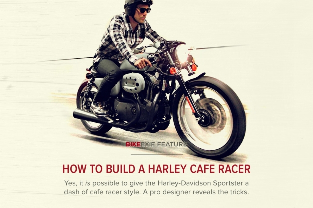
A few weeks ago our article How To Build a Cafe Racer struck a chord with many readers. The response was overwhelmingly positive and it sounds like many of you are now using the article as a guide when modifying your own bikes.
However, that guide was good as design theory, and it’s now time for a more ‘real-life’ example. Not all bikes are the same, and each has its own DNA that has to be considered before work can begin.
So this time we’re taking a bike popular within the custom scene and breaking down its strengths and weaknesses in relation to cafe racer design. And we aren’t going to start easy. Oh no: we’re looking at Milwaukee’s finest, the Harley-Davidson Sportster.
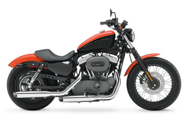
The Sportster is true American bobber material. But that hasn’t stopped many builders from creating a Harley cafe racer—notably Deus (see top image), Roland Sands and DP Customs. Even Harley themselves made the XLCR 1000 in 1977, which is now a real collector’s item.
There are positives. In 1200 form, the Harley Sportster has muscle: With a big V-twin engine to work with, you can really play to its visual strength and emphasize, through design, that power. This goes hand-in-hand with the Sportster’s low-slung posture between the wheels. They’re relatively uncommon dimensions, and not often found on European or Japanese machines.
Now, however, come the drawbacks—and there are quite a few. The first is the steeply inclined chassis top bar, which makes it hard to achieve the foundation line.
This straight and flat angle, underlining the bottom of the seat and tank, gives direction and speed to a motorcycle. And on a Harley, it’s impossible to develop without cutting and rebuilding the subframe. It’s not the end of the world but it means we have to get crafty with the design—and it means there will always be an element of ‘bobber-ness.’ Other bikes that have this problematic feature include Honda CX500s and (my beloved) Royal Enfield Bullets.
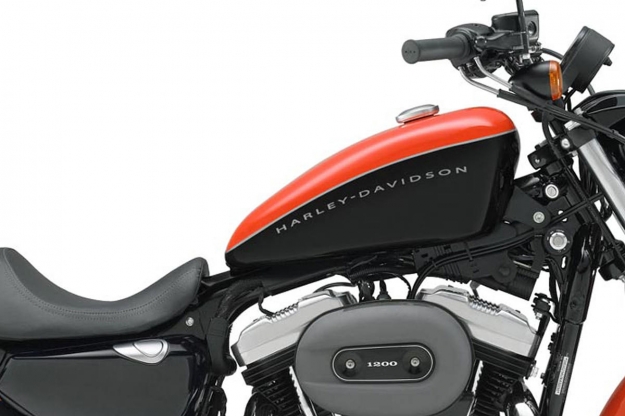 The tank. That tank has got to go! It’s a classic sure, but in cafe racer terms, it violates practically every design rule in the book. It’s too small, so it doesn’t match the visual weight of the bike. It’s too raked, and therefore eliminates the foundation line. It also peaks towards the front, away from the central axis of the engine. That’s the reason we see many longitudinal V-twin customs—Yamaha Viragos as well as Harleys—sporting a Benelli Mojave tank.
Also, on the Harley Sportster the front wheel is larger than the rear. This adds even more bobber DNA, and detracts from the even base that a café bike should sit on. Most builders make the effort to correct this.
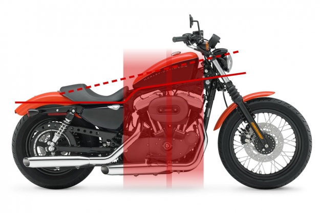
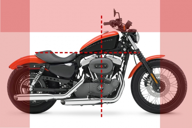
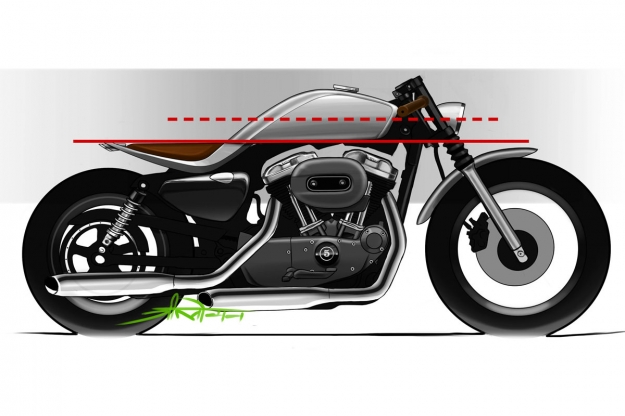
Above are the lines that make up the stock Harley Davidson. As you can see, it doesn’t fit the cafe racer profile at all. The foundation line is kinked, and the all-important ‘bone line’ is at a very unsporting angle. On top of this, we can really see how much the tank misses the visual weight parameters.
These are the lines we should be aiming for, taking into consideration the uncut Harley chassis. Straightening the kink would mean a tank coming very low over the engine—or chopping the chassis at the rear and raising the seat up. Illustrated here is the ‘axis’ around which the elements should be based. The vertical line shows the middle of the visual weight and therefore the ideal peak of the tank, and the horizontal foundation line aligns with the ideal base of the tank and seat.
So let’s take a look at three subtly different approaches to building a Harley cafe racer.

The Classic Approach This one’s close to the traditional café racer look, using a straightforward café style seat and tank.
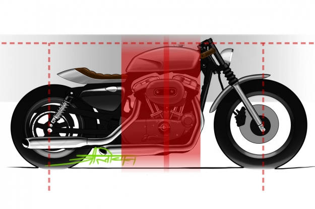
The elements now fit the cut-off points and height limit and the tank is fitting better with its peak between the cylinders, the ‘center of the visual weight.’

With overlaid bone and foundation lines, it’s clear how the Sportster’s chassis makes it hard to maintain visual continuity and a ‘fast’ look. The bone line is actually curved. This subtracts from the arrow-like feel of a café racer, but I would also say it adds a ‘hunched back’ that gives the bike a signature look of ‘power.’
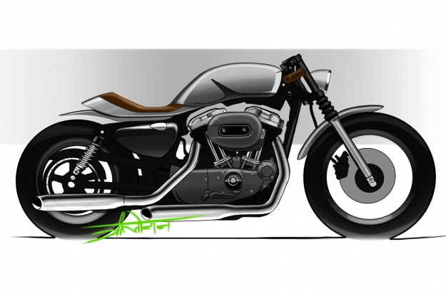
The ‘Muscle’ approach It’s harder to manufacture this one, but I tried to make something more chunky in its forms. It’s a bit more American with its square-ish nature and sunken saddle, retaining a touch of bobber style.
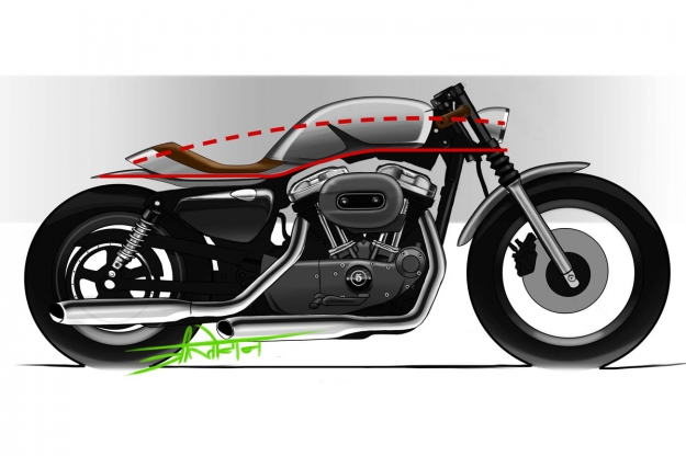
The reason this design looks a little more ‘together’ is the reduced kink in the foundation line. It’s a softer dip and therefore less troubling to the eye. I’ve also connected the tank to the seat—Something that is also worth doing for quality’s sake. Another small point is that the dent in the tank originates on the center weight axis, like the tank peak. It’s all deliberate, to make the tank look ‘planned.’
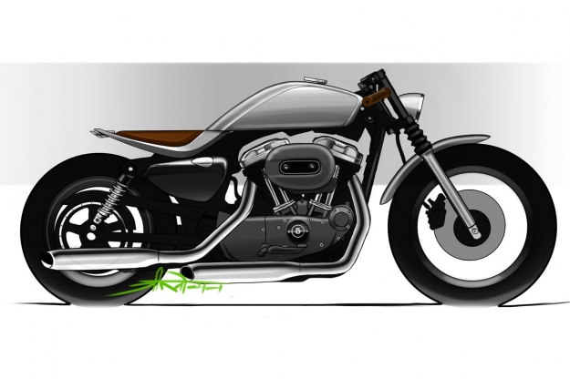
The advanced build A tough one to build, but an example to show just how UNrestrictive this framework of lines really is. I really want to demonstrate how much can be done and to let your personality influence the design to make something unique.
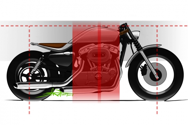
Design wise, what I have done is to try and add a straight foundation line in using trickery. I’ve used the top of the seat, not the base to make the flat foundation line but I have softened the transition between the two with a flowing line, joining them. Makes it look more considered and therefore more ‘premium’. Another small trick is the crease in the seat frame. Having the crease toward the top of the seat frame means the angle is more severe and therefore catches light. This puts the underside in shadow and visually ‘lifts’ the frame up as the shadow blends into the frame. This is something car designers do all the time to disguise weight and bulk.
As always, I hope that this serves as a useful tool to people unsure as to how to approach the looks of their project. Sketch, research and maybe even innovate something to make your pride and joy truly special.