I’m a car designer by trade: I spend my time working out how to make machinery look as good as it can. Designers are creative people by nature, so we crave the opportunity to be as free as possible in our work. We also have many parameters, tests and boundaries to refer to, to make sure we deliver the best possible ‘product.’
These guidelines are just that—guidelines. Designing a cafe racer is as much about art as science, and each bike is different in its own way. It reflects the environment, the era and the owner of the bike. Yet there are things we can do to ensure that the result will look solid and professional.
I’ve been influenced by motorbike design for several years, and have built my own café racer. I based it on the same observations that I’ve sketched out here. Hopefully they’ll inspire some fellow builders to invest time into the aesthetics of their project.
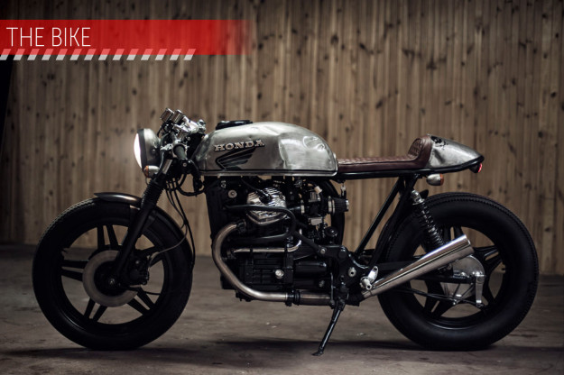
To illustrate my points, I’m using the 2014 Bike EXIF calendar cover star: Mateusz Stankiewicz’s Honda CX500, built in conjunction with the garage Eastern Spirit.

THE FOUNDATION The foundation contributes most to the structure, direction and general ‘easiness on the eye’ that makes a bike a café racer. First, the simple stuff. Café racers are defined by the flat line that runs front to back, giving an uncompromising look and lending strength and speed to the design. It’s a good idea, though not vital, that this line remains uninterrupted. (The perfect example of this rule being broken well is the Wrenchmonkees’ Laverda 750.)
This line is the first one your brain will ‘see’ and will guide your eyes along the length of the bike. If there are kinks and breaks then it eliminates continuity and, like bumps in the road, makes the experience uncomfortable. This powerful base sits above two fairly evenly sized wheels.
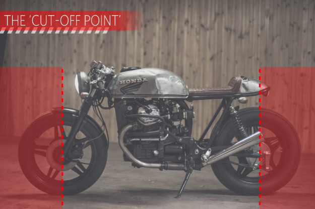
THE ‘CUT-OFF POINTS’ These lines are the wheel centerlines. Anything going beyond these lines will serve to make the bike seem ‘odd.’ Too much over the rear wheel will make the bike seem rear-heavy and poorly planned. It’s quite common for bikes to do this, however, and it’s not a big deal if crossed over by a small amount—as in our example.
If you do go too far over, then minimize the depth of the seat or cowl. There’s nothing worse than a big cowl hanging over the back end of the bike. The front is less of a problem but front fenders cut on this line look best.
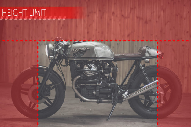
HEIGHT LIMIT Just as important as the cut-off points. The height limit gives a planned look to the design. Defined as the highest point on the fuel tank, anything protruding much above this point will take away from a café racer’s sleek and streamlined looks. It will also serve to make your bike look more like a tracker and less like a café bike. Keep it low and keep it clean. Combined with the cut-off points, this imaginary box should contain all the major elements of your design.
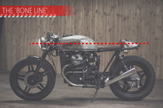
THE ‘BONE LINE’ Hugely important in car design, it is very important here as well. The bone line serves to describe where the widest point of your bodywork is. This is where your reflections on your seat, tank and lamp will fall. Think of the ‘bone’ as the 3D brother to the more 2D foundation line. They work together as a team. Here the center of the lamp is right on the bone line: A great decision that ties the whole upper together.
If you get anything right it should be this. It immediately makes the bike look like it really belongs together and is not just a jumble of parts. Next time you see a bike (or indeed a car) you like, take some time to see if it has this central ‘bone’ and where it sits. This Honda is a perfect example and, though it’s not the first thing you might realize you see, it’s why this is not just a good bike, but a great one.
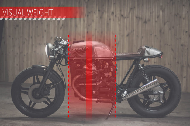
THE VISUAL WEIGHT This is where the main ‘mass’ of the bike is, and it can be split into two parts. Firstly, the main mass is the engine—including the cylinder/crank/gearbox, or anything towards the front of the subframe. This is your tank parameter. A tank longer than this will look overly big and heavy, and a smaller tank will look like the bike has outgrown it—almost bobber-like.
Secondly, and just as importantly, is the axis of the visual weight, seen here in the middle. This is usually defined by the middle of the engine, or more accurately, the middle of the cylinder/piston. This will define the ideal shape of the tank. The peak of the tank should fall right on or very close to the axis. It is amazing how much more robust and ‘sporting’ a bike looks when this is incorporated into the design.
It applies equally for bikes such as Hondas, Kawasakis and Yamahas that have inclined engine blocks. The axis still falls through the middle of the cylinder at that angle. The result is that these Japanese bikes look better with tanks that peak towards the very front of the bike and taper off towards the rider.
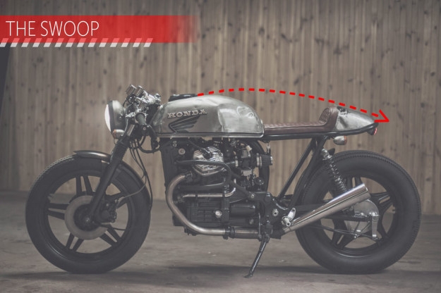
THE SWOOP Ideally you want the seat and the tank to look like they belong together. We can do this by making sure the curve of the tank flows into the curve of the cowl. This will make it look almost like the tank and the seat were once a single piece of metal, and someone scooped out a place for a rider to sit. It makes it look intentional and tight.
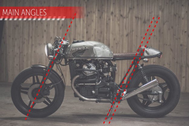
PRIMARY ANGLES Often overlooked, the differing angles on a frame with those of the forks, shocks and other parts can make a spaghetti of lines which could ruin all your hard work. Be considerate of them when adding new parts. Here this bike has a brand new subframe to clean up the wobbly CX500 original. The builder has very cleverly matched the angle of the front fork, making it look cohesive. Angles are something we take great care of when designing cars too.
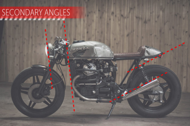
SECONDARY ANGLES Even in small areas, the builders have tried to make parallels of two or more angles on different parts. This is some subliminal stuff right here. You might not notice it—but you can bet that your brain does on a certain level.
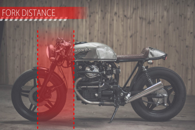
FORK DISTANCE Keep the front wheel as ‘tucked in’ as possible. It gives a bike a ‘pouncing’ and aggressive stance. I know a fork swap might seem like a good idea, but don’t make it look like a chopper, OK?
I have seen bikes that match this guide to the letter that look great. And I have seen bikes that disregard them totally, and still look amazing. Following these guidelines will give you a base on which to work and help understand why a bike looks like it does.
Once aware of these ground rules, it’s up to you how you choose to stick to them—or break them.